LLM Monitoring Guide to Cut Costs and Latency Fast
Master LLM monitoring to track cost, tokens, latency and cache efficiency. Learn instrumentation, dashboards and savings with SpendLens AI.
Last week's AI bill lands in the inbox, and the number is higher than anyone expected. The prompt change shipped on Tuesday looked harmless, the new feature was working, and yet finance wants to know which workflow ate the budget, which model switch made it worse, and why the dashboard still shows green. Provider invoices rarely answer that kind of question, because they show spend after the fact, not which request path created it.
That's why llm monitoring has moved from a debugging convenience to operational discipline. It ties spend, latency, error behavior, and workload context together so teams can trace a spike back to a release, a customer segment, or a repeated prompt pattern instead of guessing after the bill arrives. Platforms in this space are now part of a broader AI observability category that an independent estimate valued at USD 4.1 billion in 2026, with a projected path to USD 27.2 billion by 2035 at a 23.4% CAGR; that scale reflects how much production AI work now depends on measurable operations data rather than blind trust in the invoice AI observability market estimate.
A practical way to think about it is simple. If the provider bill is a utility invoice, monitoring is the smart meter with room-level breakdowns. It tells you which endpoint used the electricity, when the load surged, whether the same request got retried, and whether the waste came from a long prompt, a slow model, or a loop in your agent flow.
If you're already trying to reconcile AI usage with budget reviews, the same problem shows up in simpler form across tracking tools, especially when teams need visibility into who spent what and why. A useful starting point is this guide to AI spending tracker patterns, because the core issue is always attribution, not just totals.
Table of Contents
- Introduction Why LLM Bills Feel Invisible Until They Spike
- What LLM Monitoring Really Means Beyond Uptime
- Key Metrics That Explain Cost Performance and Quality
- How to Instrument LLM Workloads Without Slowing Them Down
- Comparing Models and Providers With Real Cost Examples
- Dashboards Alerts and Daily Summaries That Drive Action
- Putting Savings Into Practice and Measuring What You Saved
Introduction Why LLM Bills Feel Invisible Until They Spike
The hardest part of the bill spike is that it usually doesn't feel like a spike while you're building. A prompt template gets longer, a fallback path starts retrying, or a summarization flow gets wrapped around a support assistant, and each change looks reasonable in isolation. Then the monthly spend lands, and nobody can tell whether the problem came from one endpoint, one release, or one noisy customer segment.
Provider dashboards don't solve that by themselves. They show consumption, but not business context, and they rarely separate the healthy growth of a feature from the waste created by repeated prefixes, retries, or model mismatches. That's why teams need monitoring that connects a request back to the workflow, the release, and the model choice that produced it.
Why invoice totals are too late
By the time the invoice arrives, you've already paid for the waste. A support assistant might have been using an expensive model for simple routing, while a summarization workflow may have been carrying too much context in every request. Without request-level attribution, those patterns blur together.
That gap is what makes investigation expensive. Engineers open logs, finance checks the bill, and product asks which feature caused the increase, but each team is looking at a different slice of the same event. Good monitoring cuts that loop short by turning invisible spend into something you can sort, compare, and act on.
Practical rule: if you can't answer “what changed” within a release cycle, you're already paying for missing telemetry.
Why this matters for savings
The value isn't abstract. Better visibility saves time during incident review, because teams stop hunting through unrelated logs, and it saves money because you catch waste before it compounds across the month. It also gives leadership a cleaner way to talk about AI ROI, since the discussion shifts from “AI is expensive” to “this workflow costs more than it should, and here's why.”
When that visibility exists, cost questions stop being mysteries. They become engineering problems, which is exactly where they belong.
What LLM Monitoring Really Means Beyond Uptime
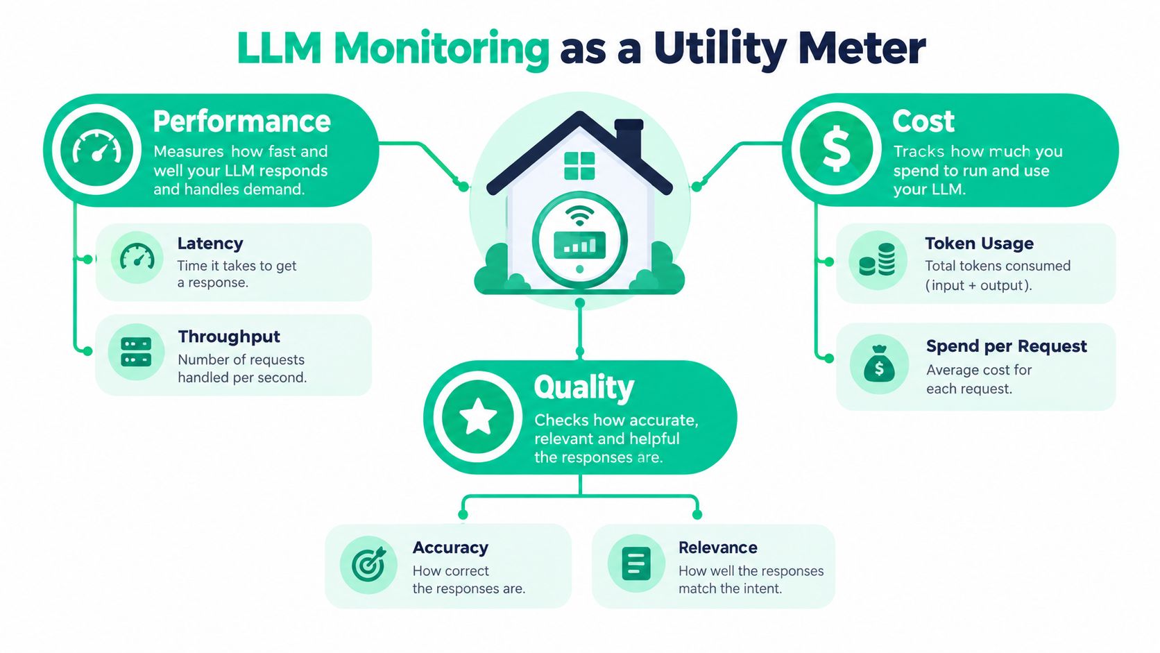
Think of llm monitoring as a utility meter with room-by-room detail, not a single light switch. Uptime tells you whether the house is still standing. Monitoring tells you which room drew power, when it happened, and whether the same appliance kept cycling on and off.
Modern observability guides describe the basics as tracking latency, token usage, cost per request, and error rates, while production systems now expose more granular signals such as prompt tokens, cached tokens, completion tokens, total usage, TTFT, TPOT, throughput, and cache utilization Datadog LLM observability guide. Those signals matter because two requests with the same token count can behave very differently once caching, model choice, or retry behavior enters the picture.
The three layers that matter
The first layer is performance. Here, latency, throughput, TTFT, and TPOT live. If a request is slow, you want to know whether the delay happened before the first token, during generation, or because the workload was too heavy for the chosen model.
The second layer is cost. Token counts alone don't tell you enough, because input, output, cached reads, and cache writes behave differently. A repeated prompt prefix can make one workflow cheaper even when the request volume stays flat, but only if you can see the cache behavior clearly.
The third layer is quality. Accuracy, relevance, refusal behavior, and other proxies tell you whether the answer is useful. A fast and cheap response that misses the point is still waste, just in a different form.
A useful mental shortcut is this, performance answers “how fast,” cost answers “how much,” and quality answers “was it worth paying for.”
Why workload context changes the answer
Aggregate token counts hide too much. A support endpoint, a summarization job, and an internal agent loop can all consume similar totals while creating very different business outcomes. That's why request volume without workload context is misleading, and why monitoring needs tags for endpoint, user group, release, or experiment.
For teams trying to connect service behavior to billing behavior, that same breakdown is what makes data useful. You can compare a noisy workflow against a quieter one, spot the outlier, and decide whether the fix is prompt trimming, model switching, or cache tuning.
If you want a separate lens on service health, broken pipelines to trusted data is a useful reference point, because the same observability discipline applies when the “pipeline” is an LLM request path. For implementation patterns around tracking systems in the stack, the write-up on AI infrastructure monitoring fits naturally here.
Key Metrics That Explain Cost Performance and Quality
The easiest way to get lost in monitoring is to collect every metric and understand none of them. The better approach is to focus on the few signals that explain why a request was expensive, slow, or low quality. Once those are visible, the rest of the debugging path gets shorter.
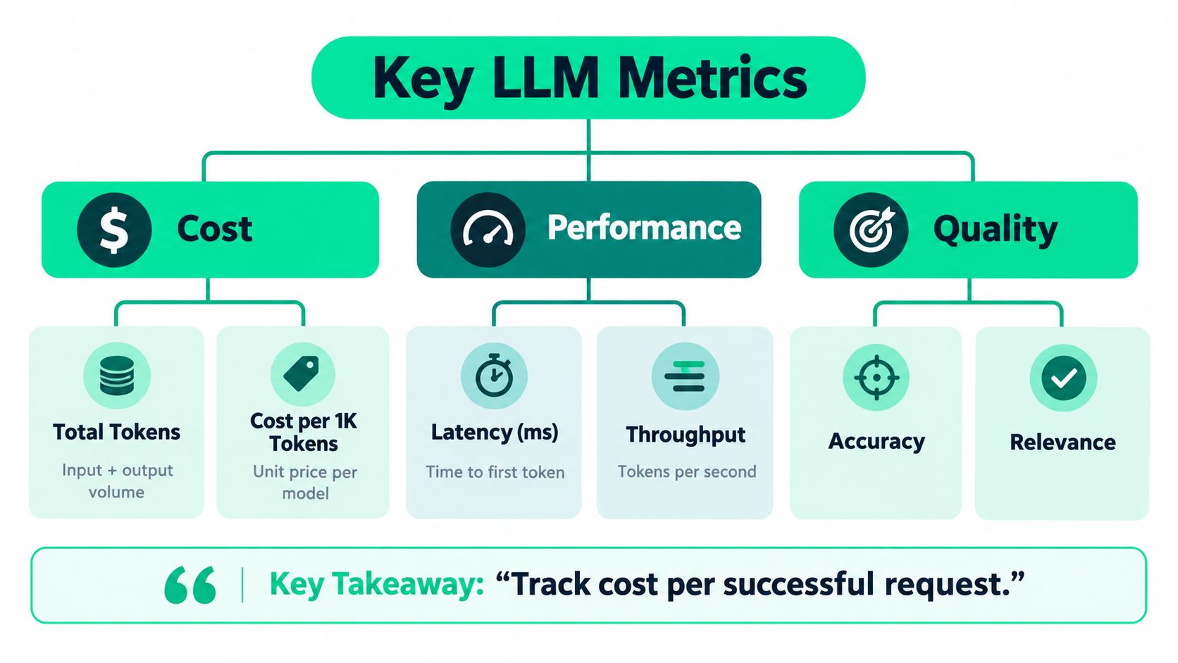
Track cost per successful request.
Cost signals first
Start with input tokens, output tokens, cache writes, and cache reads. Caching only changes the economics of input usage, not output usage, so if you lump everything together you miss the marginal cost of retries and repeated prefixes cached token pricing. That separation matters in template-heavy systems where the same instructions appear again and again.
A request can look normal on volume and still be wasteful. If a workflow sends the same prefix repeatedly, a healthy cache hit rate can materially reduce spend even when the number of requests does not move. That is why the cheapest-looking bill is not always the most efficient workload, and the biggest savings often come from prompt cleanup rather than model replacement.
Performance signals that explain user pain
Latency deserves more than a single average. TTFT tells you how long users wait before they see the first token, and TPOT helps you understand how fast the model keeps producing after that. Together, they tell you whether a slow experience is caused by request setup, model generation, or a larger workload issue.
Throughput is the other side of the same story. A system can be cheap on paper but still fail users if it can't keep up during bursts. That's why performance monitoring has to be read alongside cost, not instead of it.
Quality signals that keep cost honest
Quality is the guardrail that stops low spend from becoming false economy. If a cheaper model returns more irrelevant answers, the savings evaporate in rework, escalations, or manual review. Monitoring should keep quality tied to the specific endpoint or release that changed, because broad averages hide the regression.
For day-to-day review, the most useful views are the ones that correlate endpoint, user segment, or release with token patterns and latency changes. That makes it easier to spot whether a new prompt template, a routing rule, or a model switch introduced the problem.
The same logic applies when you compare workloads across teams. One service may be spending more because it handles longer documents, while another may be paying for repeated instructions that should have been moved out of the prompt. Those are different fixes, and monitoring should make the difference obvious.
For deeper spend analysis, the practical dashboard patterns in AI spend analytics are worth pairing with this metric set.
How to Instrument LLM Workloads Without Slowing Them Down
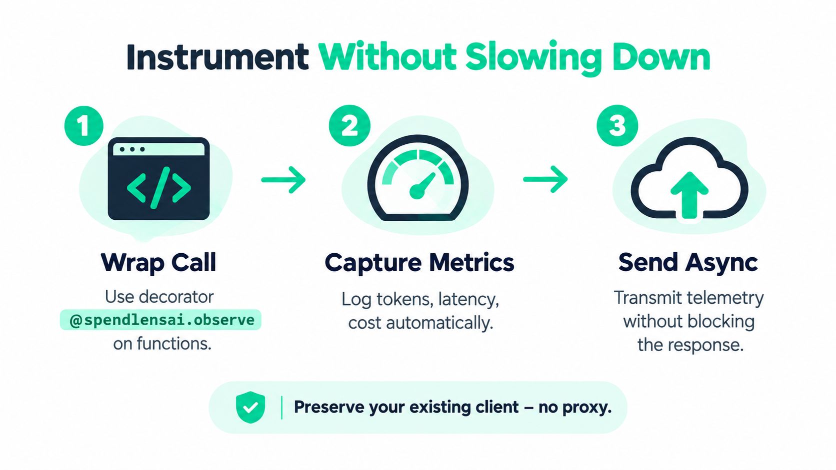
The cleanest instrumentation is the one your team keeps. In Python services, that usually means adding a decorator, a helper, or a client tag, then sending telemetry out of band so the request path stays fast. You preserve the provider SDK, you keep retries intact, and you avoid a proxy in the middle of every call.
Lightweight attribution that survives real codebases
A pattern like @spendlensai.observe works because it wraps the function you already have. A track() helper is useful when the call site is more dynamic, and client.tag() helps attach business context such as endpoint, workflow, feature, or experiment. That makes it possible to compare a support assistant against a document summarizer without rewriting both services.
The practical win is attribution. When a finance review asks which feature drove spend, you want a clean answer based on tags, not a detective story built from timestamps. That same tagging also helps with forecasting, because you can group similar calls and estimate what a release is likely to do before the bill lands.
Privacy-aware defaults that keep adoption easy
Good defaults matter here. Metadata-only tracking keeps raw prompts out of the system by default, template-only sampling gives you enough context to spot prompt waste, and hashed API keys reduce exposure when you need to tie requests back to a service owner. That balance is what lets teams instrument production without turning observability into a data-retention problem.
A support assistant and a document summarization job often need different treatment. The assistant may need endpoint-level tags and cache metrics, while the summarizer may need document class, length band, and model version. Once the workload is classified, you can compare apples to apples instead of mixing unrelated traffic in the same view.
Practical rule: instrument for attribution first, enrichment second, and raw text only when you truly need it.
What to keep out of the hot path
Avoid anything that blocks the response. The telemetry should leave asynchronously, and the client configuration should stay intact so retries, timeouts, and provider-specific behavior still work as intended. One option in this space is SpendLens AI, which adds lightweight telemetry to OpenAI and Anthropic calls while preserving existing clients and tracking spend drivers, cache efficiency, and model-switch opportunities.
For endpoint-level patterns, the practical framing in endpoint monitoring fits the same approach. Once requests are tagged and emitted cleanly, the rest of the system becomes much easier to reason about.
Comparing Models and Providers With Real Cost Examples
A model with the lowest sticker price can still cost more in practice if it misses cache opportunities, needs longer prompts, or forces a later migration. The better choice is the one that produces the right answer at the lowest total cost for that workload, with latency and migration risk kept within bounds. Monitoring data should drive that decision, not habit or vendor familiarity.
Cache economics change the comparison
Caching changes the math in a very specific way. A cache read is usually far cheaper than a fresh input, while the first write can carry a premium, so the break-even point depends on whether the workload repeats the same prefix often enough to repay that write cache pricing mechanics. OpenAI's example shows the same pattern from another angle. Repeated-prefix workloads can reduce time-to-first-token and token costs when cache hits rise OpenAI prompt caching example.
Anthropic's pricing structure makes the tradeoff easier to see. A 5-minute cache write costs 1.25 times the base input rate, a 1-hour write costs 2 times the base input rate, and a cache read costs 0.1 times the base input rate. The first write is a modest premium, then reuse becomes much cheaper when the prefix repeats.
| Provider Signal | Pricing Mechanic | Example Savings |
|---|---|---|
| OpenAI prompt caching | Cached input can lower token costs and time-to-first-token latency when reuse is high | A published example shows 33% token-cost savings at a 50% cache rate and 55% savings at a 70% cache rate |
| Anthropic prompt caching | Cache write premium followed by discounted cache reads | A cached prefix becomes much cheaper to reuse once repeated prompts justify the initial write |
| OpenAI cache diagnostics | Dashboard compares cached and uncached tokens | OpenAI says the dashboard helped improve hit rates by a few percentage points and reduce costs by 20% OpenAI cache diagnostics |
A practical decision matrix
Rank each model or provider option by estimated monthly savings, confidence, and migration risk. The biggest win is often not the broadest change, but the first one with enough evidence to justify a safe test. Repeated instructions, long templates, and oversized context windows usually rise to the top quickly.
Keep the workload constant and compare one endpoint at a time. OpenAI, Anthropic, Gemini, Qwen, Mistral, DeepSeek, and Llama families can all look attractive in isolation, but the right answer depends on prompt shape and the quality bar. Workload classification keeps the comparison honest by separating a support task from a research workflow.
Where savings usually show up first
The earliest wins usually come from repeated prompts, long system messages, and workflows with multiple internal steps. Those are the places where a model switch or a cache improvement can reduce spend and latency without changing the product surface. Once those patterns are isolated, the before-and-after comparison becomes much easier to prove.
Dashboards Alerts and Daily Summaries That Drive Action
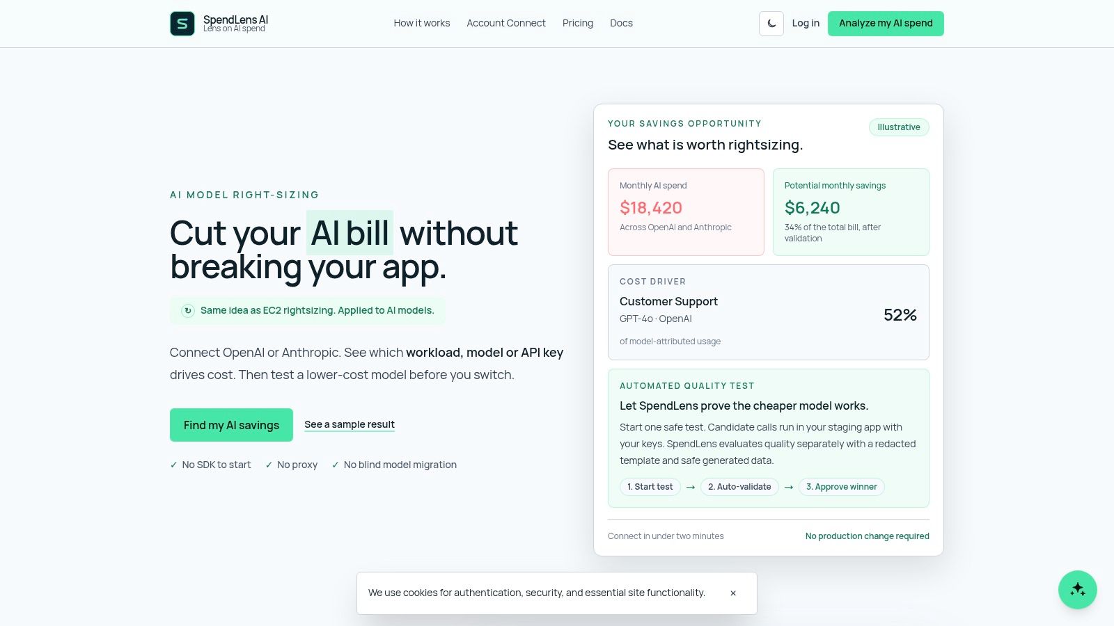
A dashboard that only shows totals is a receipt, not a control system. The useful one breaks spend down by project, provider, model, and workload, then layers in token usage, cache efficiency, and per-call detail so engineers can see exactly where the money went. That's the difference between reacting after the close and steering during the week.
Alerts should catch the shape of the problem
A useful alerting setup watches for cost anomalies, latency spikes, and error rates in rolling windows, then attaches trace context so the root cause isn't a guessing game. That context matters because a bill spike after a deploy is usually not visible from infrastructure metrics alone. You need the per-request trail to tell whether the workflow changed, the prompt changed, or the model choice changed.
For teams already using a broad observability stack, a strong dashboard design guide like the one from MetricsWatch on dashboard design is a useful companion, especially when the goal is to turn raw metrics into a weekly decision loop. The LLM-specific version just adds token and cache behavior to the same operational mindset.
Daily summaries close the gap for non-engineers
Finance and leadership usually don't want ten graphs. They want yesterday's spend, the top cost driver, and the highest-impact recommendation in plain language. That kind of summary gives them a quick read on whether a release, customer cohort, or model choice changed the budget trajectory.
Hosted ingest, retention settings, and email reports make that easier to operationalize, especially for teams that need an internal paper trail without building their own reporting stack. Downloadable sample reports also help engineering and FinOps review the same numbers in the same meeting, which cuts down on hand-built spreadsheets and one-off interpretations.
Operational insight: if a dashboard doesn't help someone make a decision before lunch, it's probably too broad.
What teams actually use day to day
The best setups become a daily habit. Engineers check the noisy endpoint, finance checks the spend driver, and managers review the recommendation that says where to test next. That shared rhythm is what turns monitoring from a postmortem tool into an operating system for AI spend.
Putting Savings Into Practice and Measuring What You Saved
Savings only count when they're measured before and after. Start with the highest-impact workload, then test the change with the least migration risk, because that order gives you faster proof and fewer false starts. If the evidence is strong, expand the change. If it isn't, move to the next candidate.
The most common wins come from trimming prompt waste, improving cache hit rates, and comparing lower-cost models on classified workloads. A faster response and a lower bill are both good outcomes, but the important part is showing which workload changed, how much it changed, and whether quality stayed acceptable. That's the number leadership can use in planning and forecasting.
A simple validation checklist
- Pick one workload: Choose a single endpoint or feature with clear tags so before-and-after comparisons stay clean.
- Rank the option: Judge each change by impact, confidence, and risk, not by guesswork.
- Measure the same window: Compare spend, latency, and error behavior over the same type of traffic.
- Check quality separately: Don't treat lower spend as success if relevance or accuracy drops.
- Report the outcome: Share estimated money saved, time saved in investigation, and the next test to run.
Teams spending $2K to $50K per month usually get the fastest return by fixing repeated instructions and long templates first, then tuning cache behavior, then testing model switches on the workload that already has enough traffic to measure. That sequence keeps the review concrete and avoids turning optimization into a rewrite.
If you want to see where SpendLens AI fits into that workflow, it adds lightweight instrumentation for OpenAI and Anthropic services, shows spend drivers and cache efficiency, and helps teams compare model-switch opportunities without replacing existing clients. Visit SpendLens AI to review the product and see whether your current workloads are already leaking money.